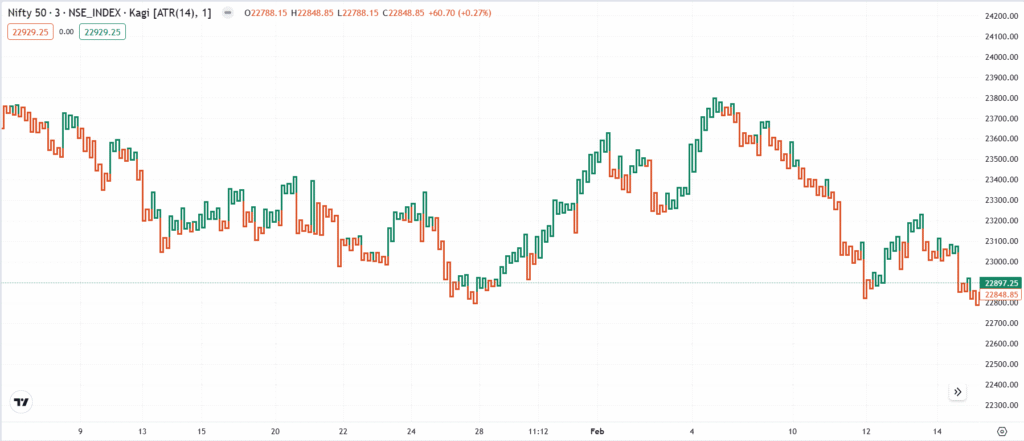
The Area Chart evolved from the Line Chart and became widely used in financial reports and stock market analysis in the mid-20th century. It fills the area below the line with colour, making trend visualization clearer. This chart is particularly useful for long-term investors and financial analysts who need a quick overview of price trends.
Chart Construction
- A line chart with the area below the line shaded.
- Makes it easier to visualize price trends over time.
Importance
- Provides a clear and visually engaging representation of price trends.
- Useful for long-term investors looking at historical price performance.
- Frequently used in financial reports, dashboards, and presentations for quick insights.
Limitations
- Lacks detailed trading data such as opening, high, and low prices.
- Not useful for traders who rely on candlestick patterns and technical indicators.
Rate this post
