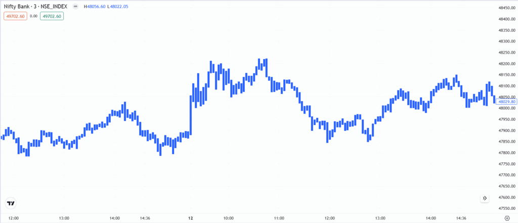
The High-Low Chart is a simplified price representation that dates back to the early 20th century, when traders at stock exchanges like NYSE and LSE needed a quick way to see the highest and lowest prices of stocks in a single glance. This chart type eliminates open and close prices, focusing purely on the stock’s volatility and range within a specific period.
Chart Construction
- Similar to an area chart, but incorporates high, low, and close prices.
- The filled area represents the full price range (High-Low).
Importance
- Great for analysing volatility by highlighting price extremes.
- Useful for identifying support and resistance zones.
- Helps traders focus on price swings without distractions from opening or closing prices.
Limitations
- Lacks detailed price information (no open or close prices).
- Not widely used in trading, so it may require additional indicators for better analysis.
Rate this post
