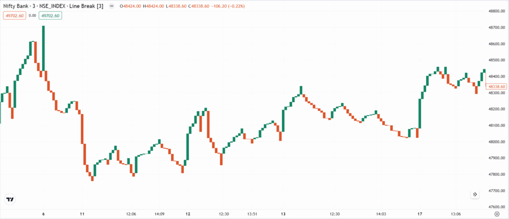
The Line Break Chart was developed by Japanese traders, similar to Point & Figure and Renko Charts. It became popular in the Western world after Steve Nison introduced it in his 1990s book “Beyond Candlesticks.” Instead of time-based plotting, a new line is drawn only when the price moves beyond a predefined threshold, making it ideal for trend reversals and breakout trading.
Chart Construction
- A new upward line (white/green) appears when the price exceeds the previous high.
- A downward line (black/red) is drawn when the price falls below the last low.
- No new line is drawn if the price stays within the previous range.
- This method removes minor fluctuations, making trends clearer.
Importance
- Eliminates market noise by ignoring minor price movements.
- Helps traders identify strong trends and reversals
- Ideal for breakout and momentum trading strategies.
- Reduces false signals compared to candlestick and bar charts.
Limitations
- Not ideal for short-term traders who need precise entries and exits.
- Since it waits for confirmation, signals may come late.
- Requires manual adjustment of settings (e.g., 3-line break, 5-line break) based on market conditions.
Rate this post
